UI Components
Switch
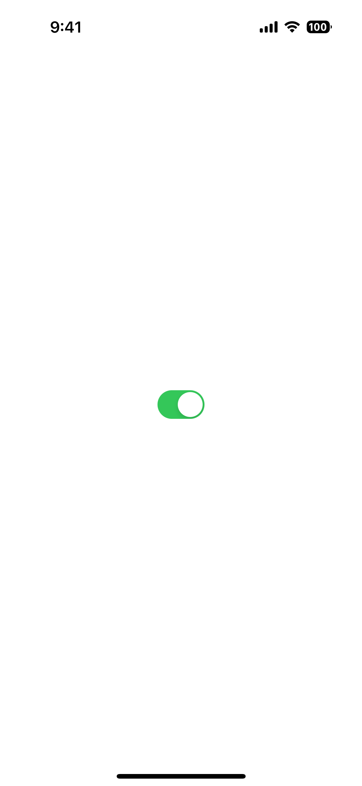
UI component for toggling state on or off.
<Switch> is a UI component that lets users toggle between two states.

xml
<Switch checked="true" />html
<Switch checked="true" />tsx
<switch
  horizontalAlignment="center"
  checked={switchValue}
  onCheckedChange={(args) => {
    setSwitchValue(args.value)
    console.log(args.value)
  }}
></switch>
<label textAlignment="center" width="100%">
  {JSON.stringify(switchValue, null, 2)}
</label>
tsx
<stacklayout>
  <switch
    horizontalAlignment="center"
    on:checkedChange={handleChange}
    checked={switchValue()}
  ></switch>
</stacklayout>
svelte
<stackLayout>
  <switch horizontalAlignment="center" bind:checked={switchValue}
  ></switch>
  <label textAlignment="center" width="100%">{switchValue}</label>
</stackLayout>
vue
<Switch v-model="switchValue" />Examples
Styling a Switch
xml
<Switch checked="true"
  color="#BFCDAC"
  backgroundColor="green"
  offBackgroundColor="#DC493D"
/>
Props
checked
ts
checked: booleanGets or sets the state switch.
Defaults to false.
offBackgroundColor
ts
offBackgroundColor: ColorGets or sets the off-state background color.
See Color.
...Inherited
For additional inherited properties, refer to the API Reference.
Events
checkedChange
ts
on('checkedChange', (args: PropertyChangeData) => {
  const switch = args.object as Switch
  console.log('Switch checked:', args.value)
})
See PropertyChangeData.
Native component
- Android:
android.widget.Switch - iOS:
UISwitch

